TERESA GRINBERG
TELLING STORIES THROUGH LIVING JEWELRY.
FULL BRANDING FOR A JEWELRY HOUSE BORN FROM 30 YEARS OF CRAFT.
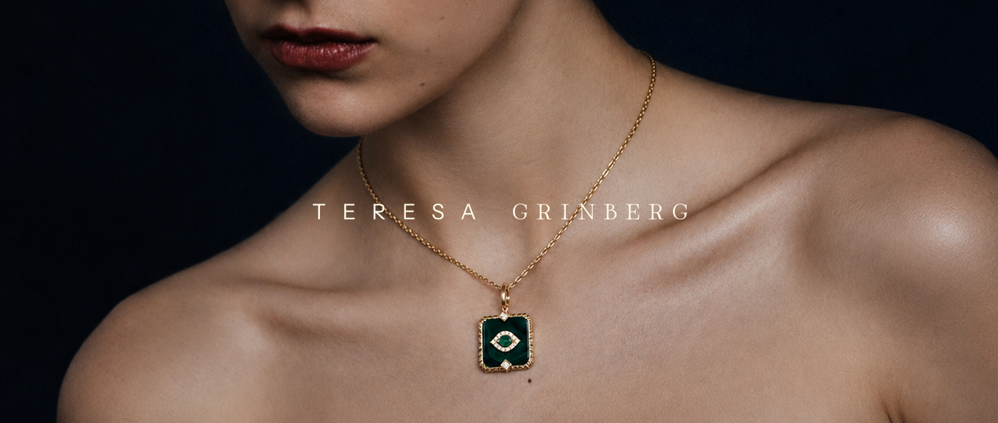
Teresa Grinberg spent three decades inside the jewelry industry before deciding to build something that was, finally, entirely hers. The challenge wasn't simply launching a brand, it was giving name, form, and soul to an entire career. A founder who is the expertise, and who needed an identity that could hold everything she carries.
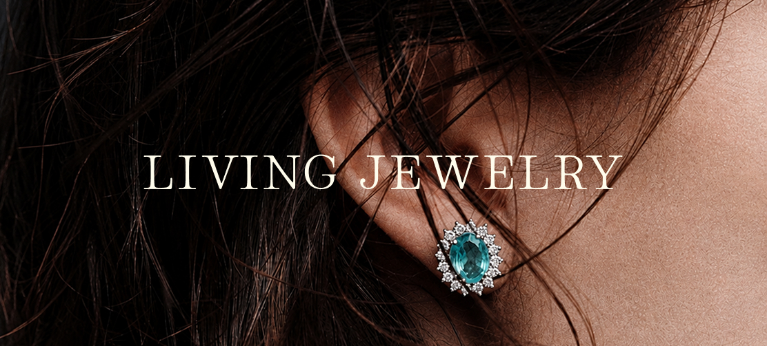
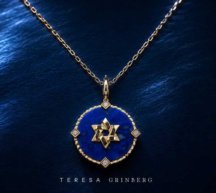
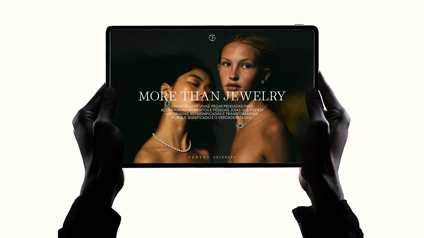
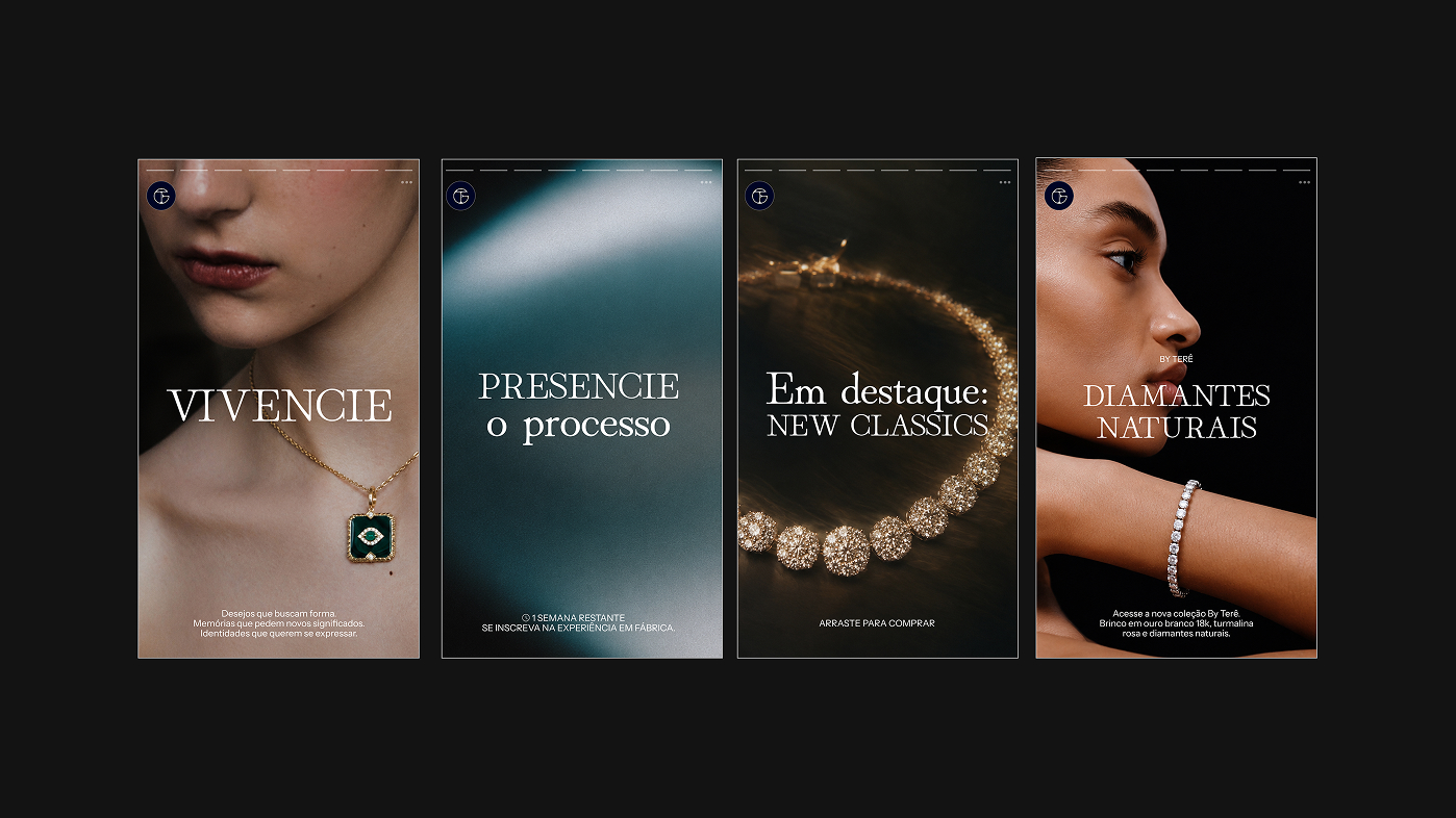
A piece of jewelry isn't born finished. It follows the person who wears it, shifts form, gains new meaning across time. Living Jewelry - became the central concept and the lens for every decision: from positioning to photography, from tone of voice to packaging.
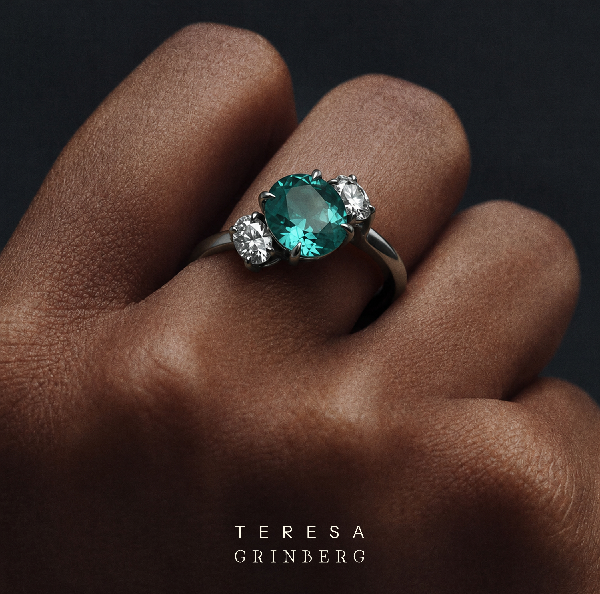
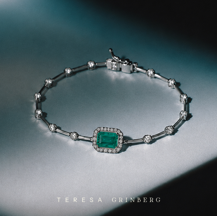
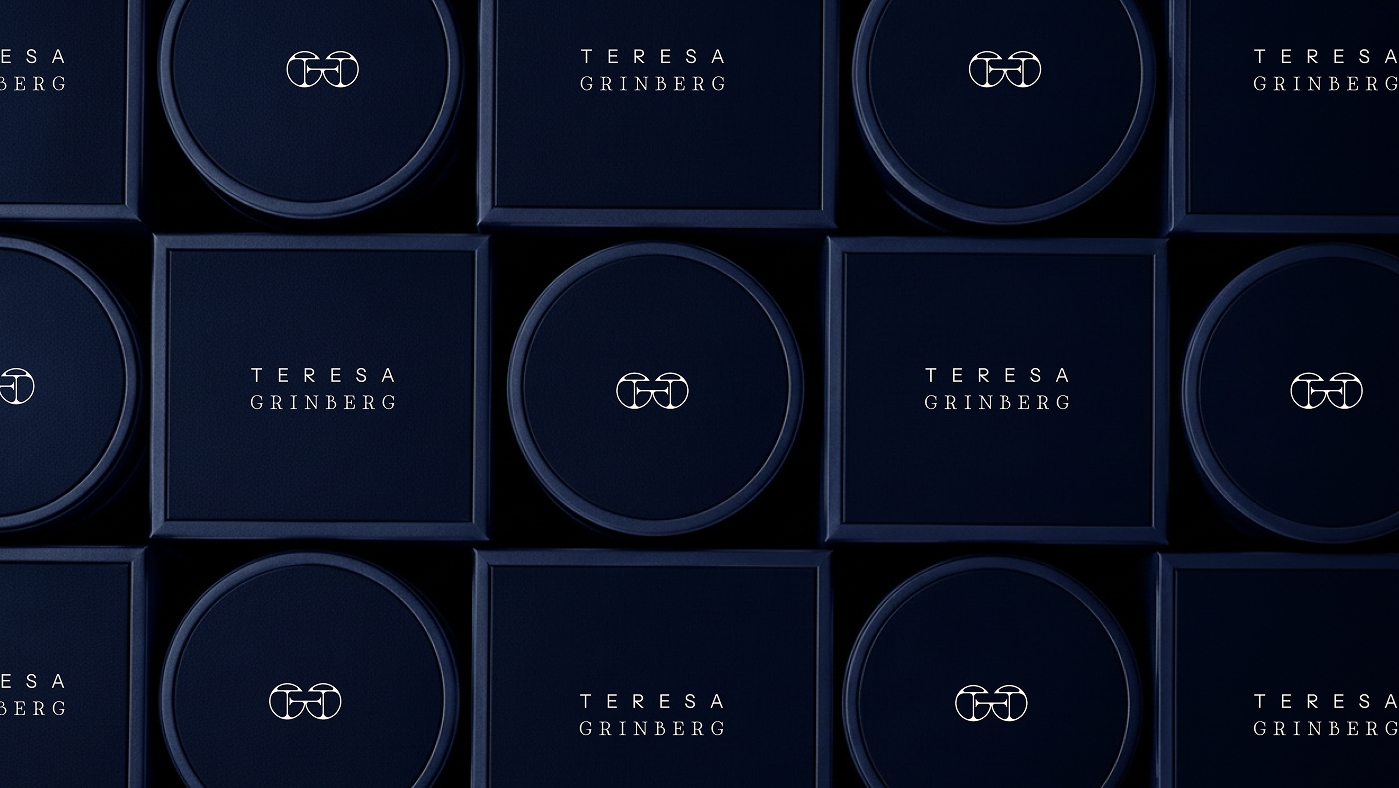
The wordmark pairs two distinct typefaces in deliberate tension. TERESA set in a geometric sans-serif; clean, modern, precise. GRINBERG in a classical serif; timeless, crafted, with weight. Together they hold the brand's core duality: the permanence of the classic and the ease of the contemporary. Neither wins. Both are necessary.

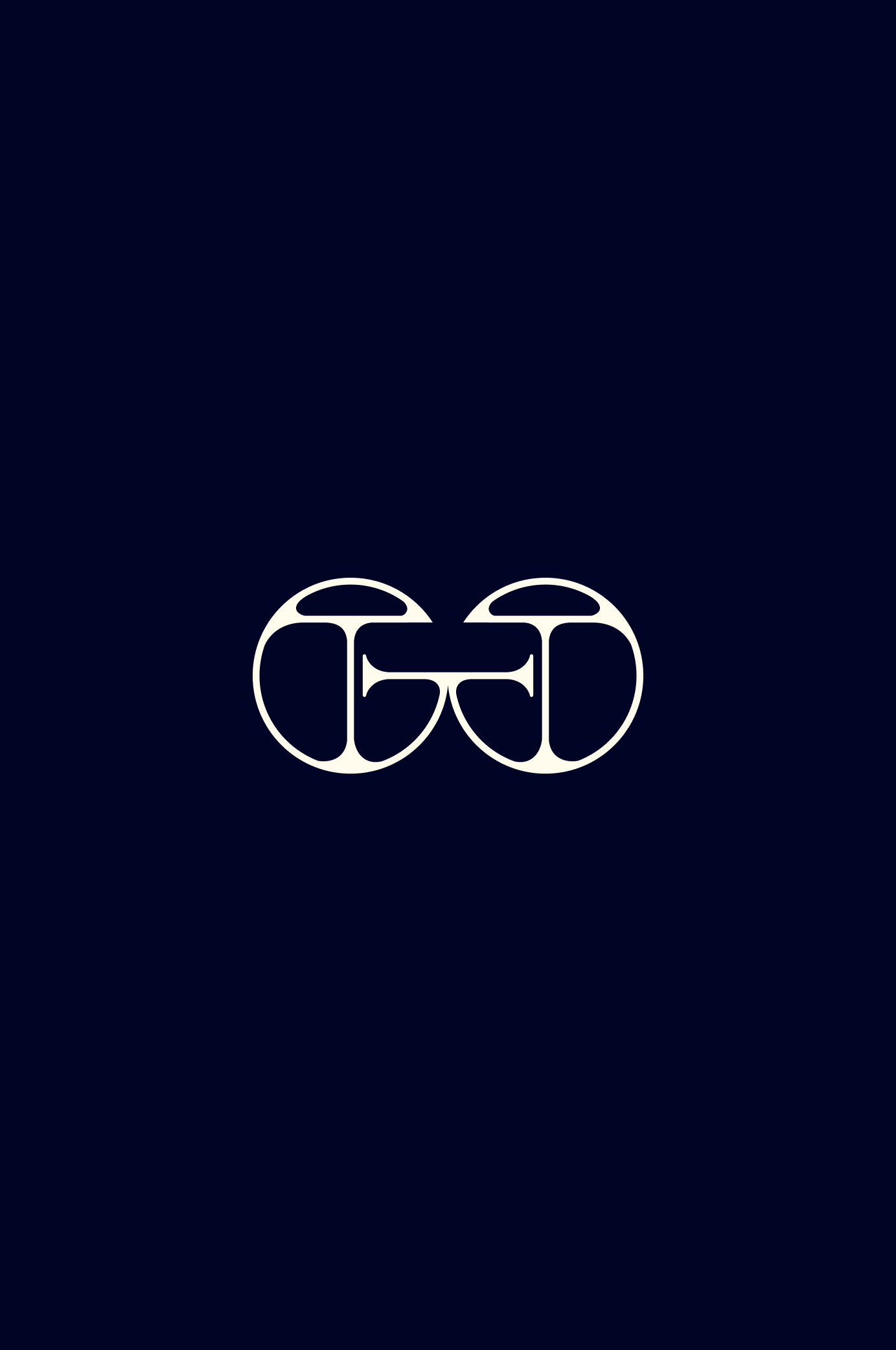
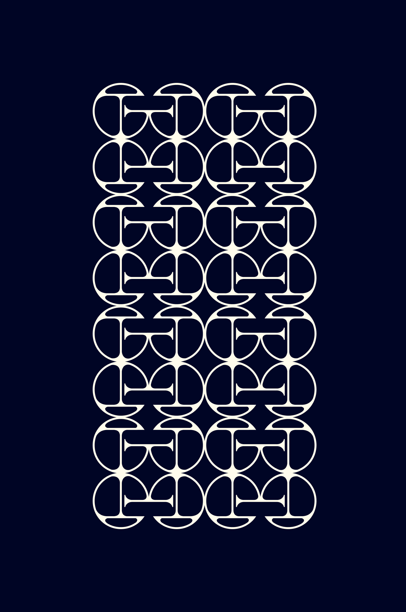
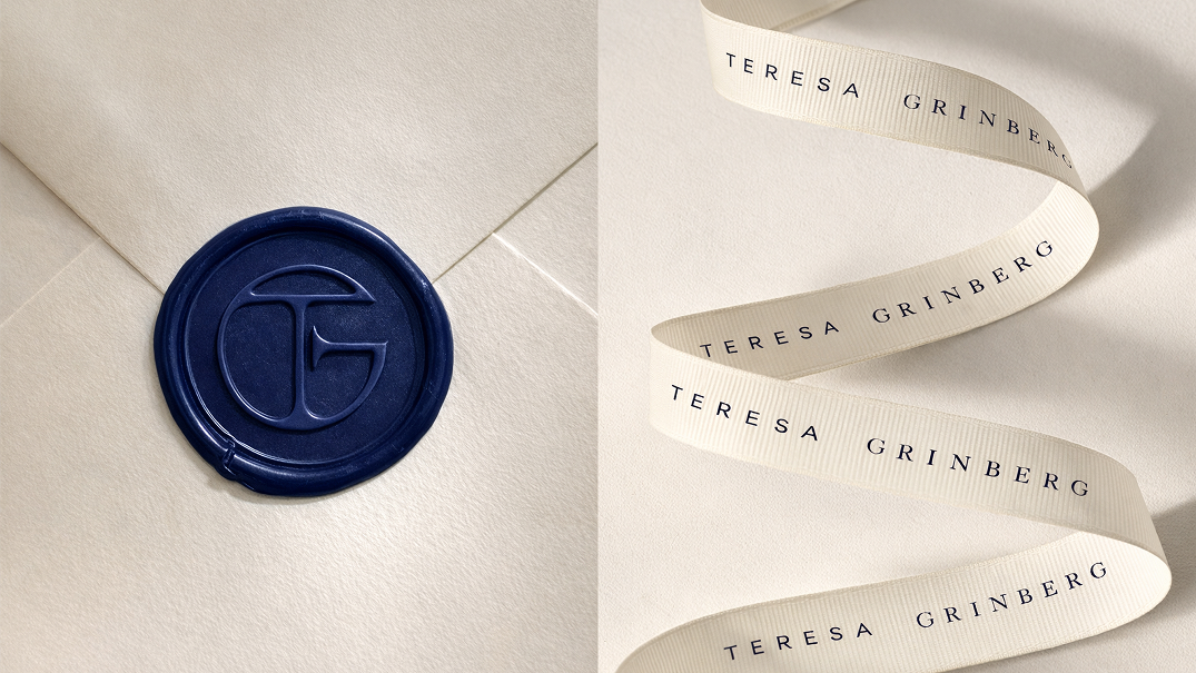
Two letters that lock inside a circle. Like a link in a chain, like a story that never ends. Repeated, it becomes a pattern; recognizable, elegant, unmistakably Teresa.
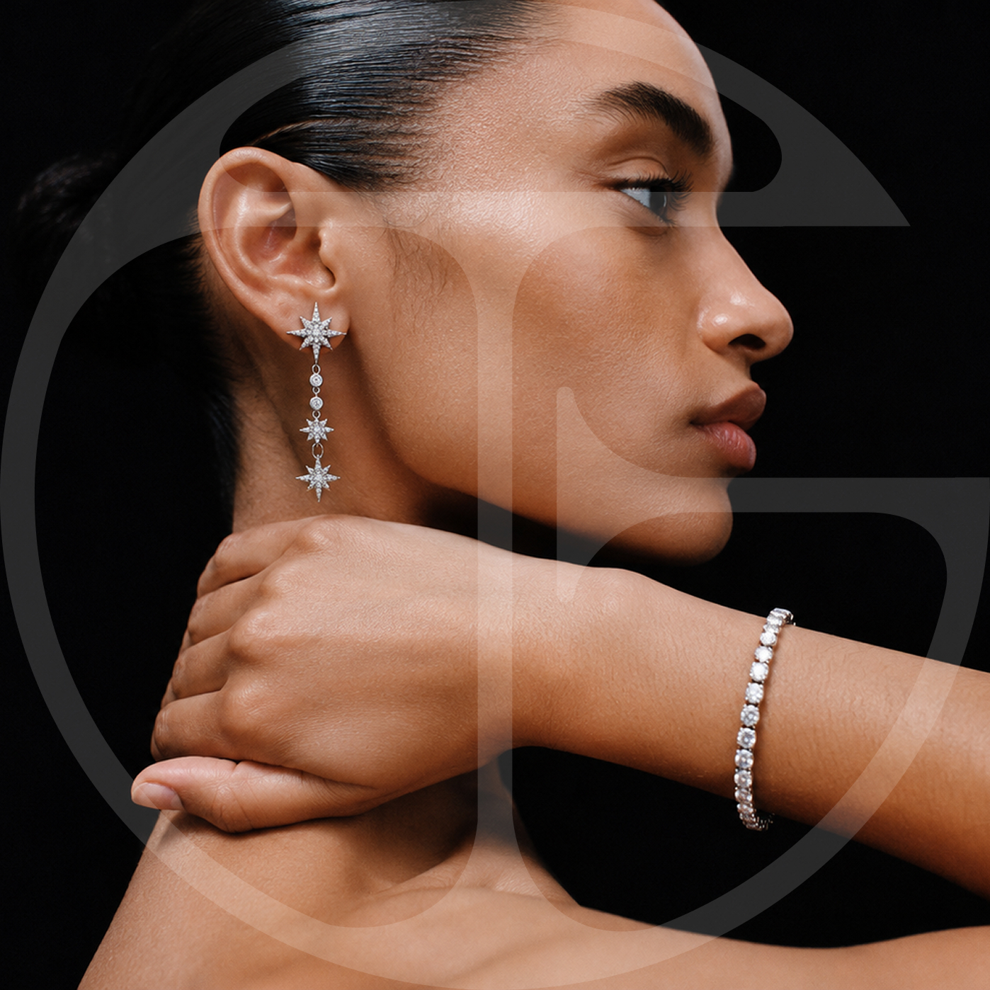
Born from experience. Built to last.