DECÍ
THE SIMPLE INSIDE THE COMPLEX.
FULL BRANDING FOR A CAREER AND CULTURE CONSULTANCY, BUILT AROUND ONE EXPERT'S POINT OF VIEW.
Clarissa Grunberg brought Studio Cura more than a decade of credibility built inside HR - an analytical, deeply human read on people, and a consulting practice already shaped entirely around her own judgment. What she didn't have was a brand that could carry that authority on its own: clear enough to reach professionals and companies alike, without her needing to be in the room every time. The challenge wasn't inventing a persona. It was structuring a positioning sharp enough to let Clarissa show up with clarity, authority and authenticity - with or without her name doing the talking.
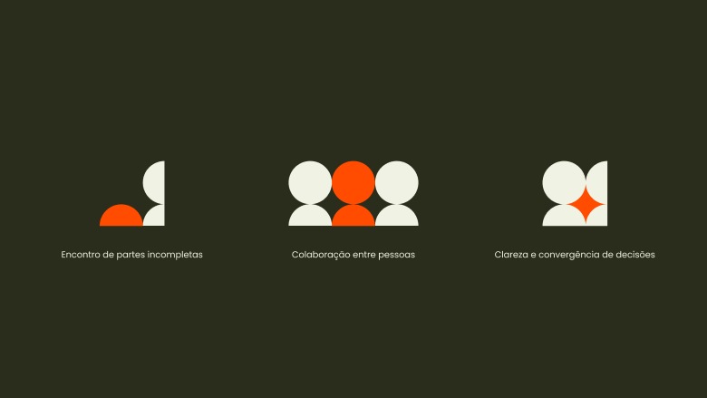
Most names either explain too much or too little. Decí does neither. It comes from decifrar - to decipher - the ability to read what's implicit and give shape to what's scattered. The logo follows the same logic: two incomplete forms that only complete each other in relation, a symbol built from the meeting point between people rather than from either one alone. Together, name and logo make the same argument Clarissa makes with every client: that clarity isn't only about simplifying, it's about seeing further.
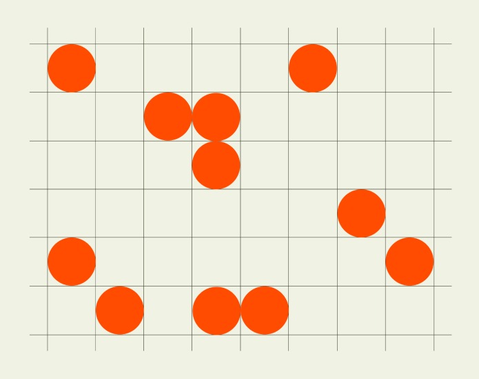
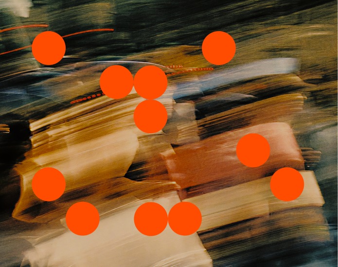
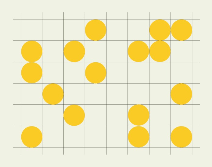
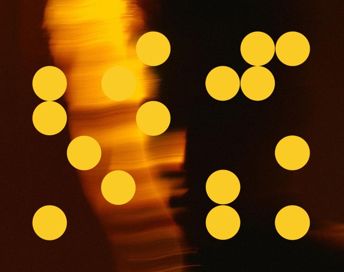
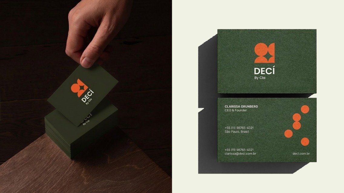
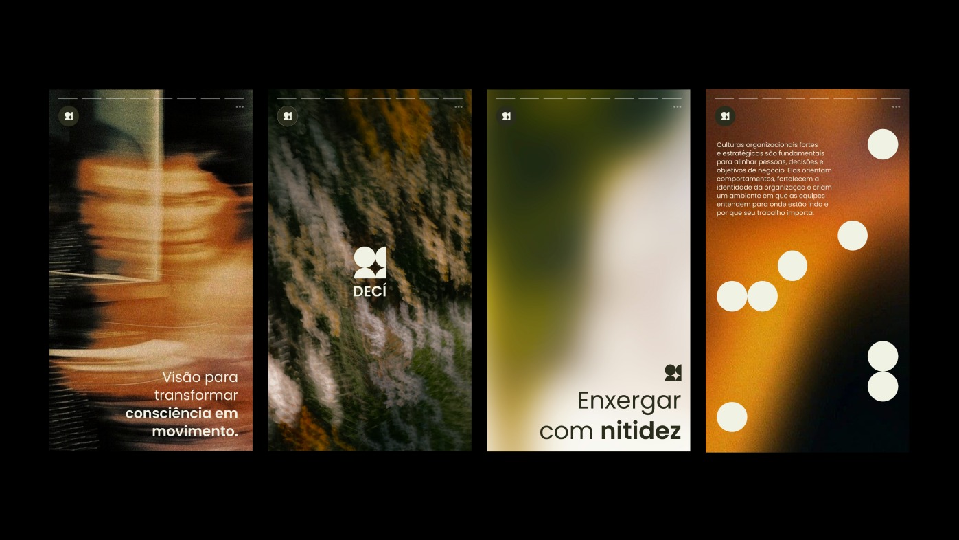
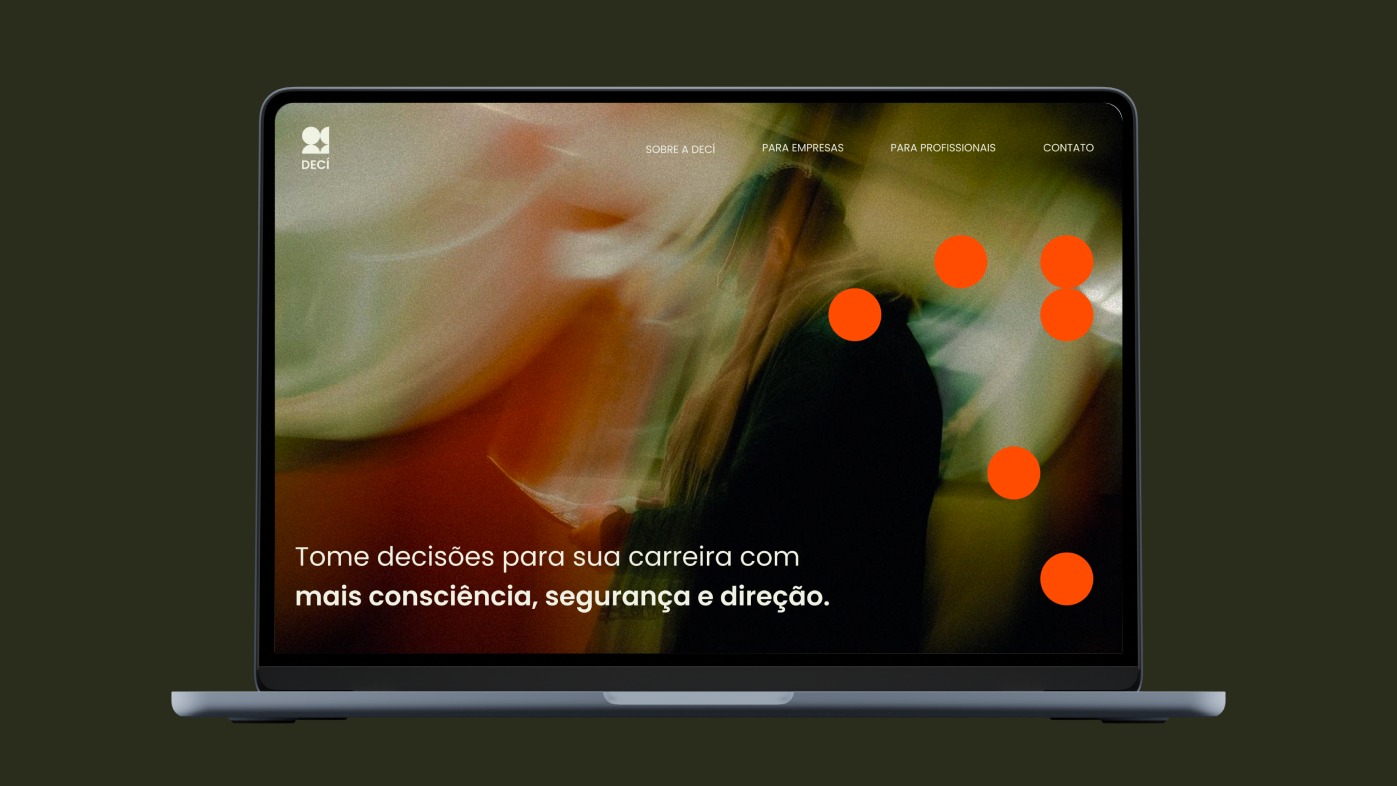
Playful within limits: every circle sits on a grid, spaced with intention rather than left to chance. It's a small structural echo of what Decí actually does: bring freedom of thought inside a framework rigorous enough to hold it.

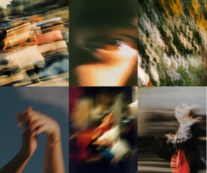
Nothing here is in focus by accident. The blur holds the inner subjectivity of the process and individual journey of each person or company.
People rarely arrive anywhere in a straight line. The motion blur keeps that honest, always mid-step, mid-decision, closer to becoming than to arriving.
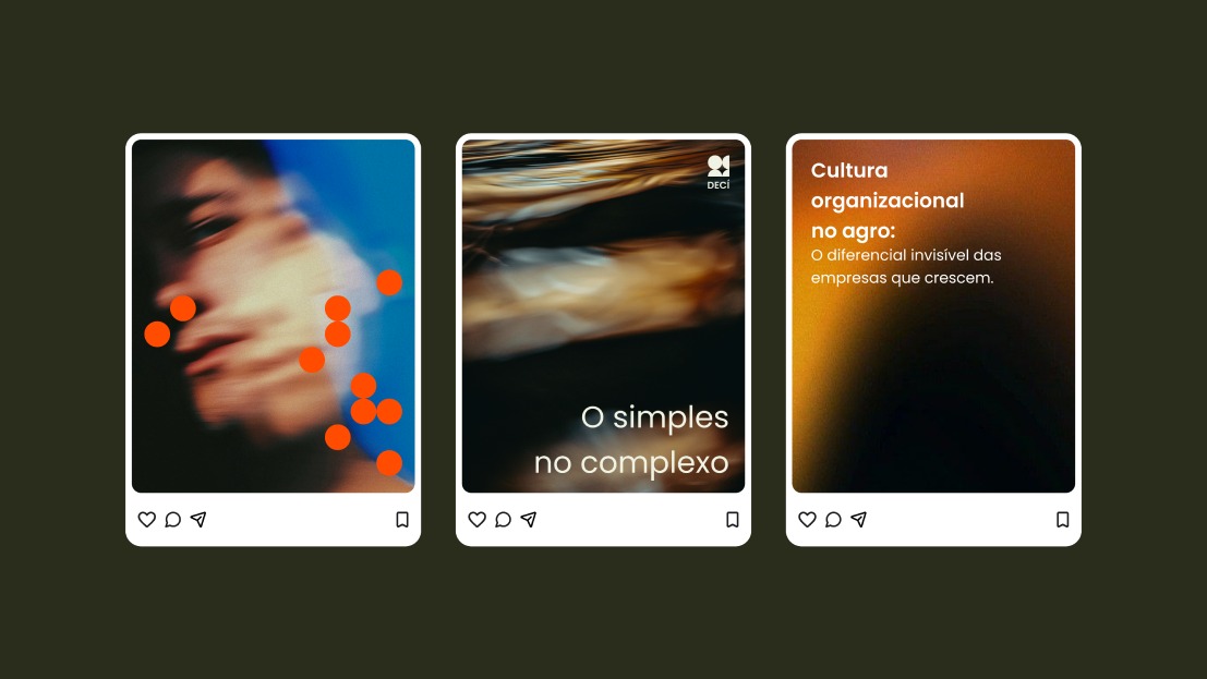
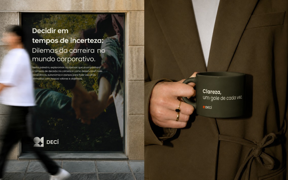
From a one-on-one mentoring session to a boardroom presentation, from an Instagram post to a printed business card, every touchpoint carries the same idea forward, so the brand feels just as clear whispered to one person as it does presented to a room.
Clarissa's lightness isn't just in how she talks, it's built into every object that carries her name and her brand. Even the small gestures - a thank-you note, a parting gift after a session - carry the same tone as everything else: considered, warm, never performative. The identity doesn't stop at the logo. It's the whole experience of being someone's client.