CASA IKIGAI
BACK TO THE ESSENTIAL.
FULL IDENTITY FOR A RETREAT THAT WAS BORN ALONGSIDE THE SPACE ITSELF.

Casa Ikigai came to Studio Cura still under construction - literally. The chalets still being built, the experiences still being imagined, the founders holding complementary visions of what this place, facing the Joanópolis reservoir, should become. The challenge was creating an identity able to translate different voices into a single narrative: one elastic enough to grow alongside the project's natural evolution.
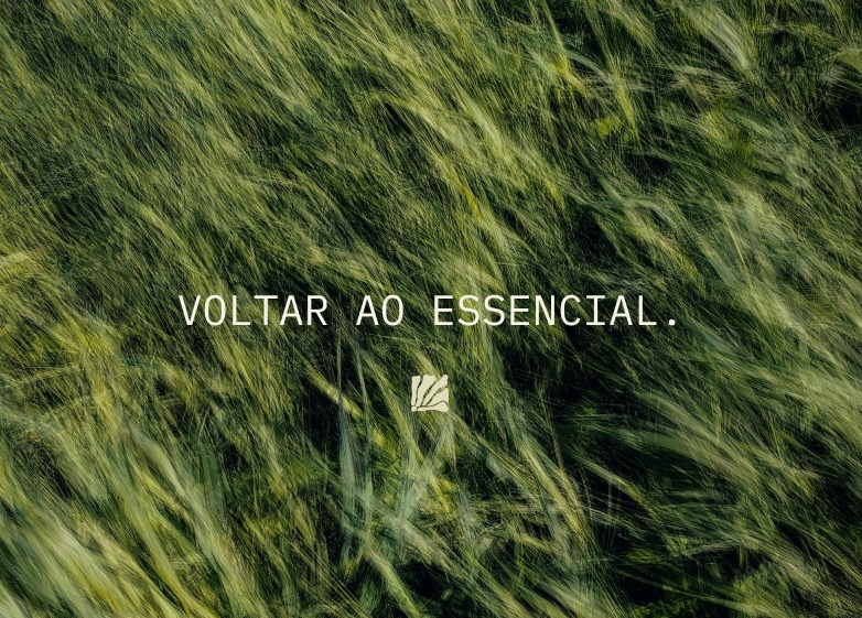
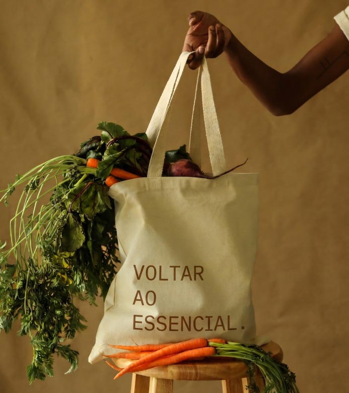
Back to the essential is both invitation and origin: the line that sums up why this place exists, putting guest and history at the same center. It became the principle behind every decision at Casa Ikigai - from the architecture to the products at the Honest Market, from the activities on offer to the experience of arriving.
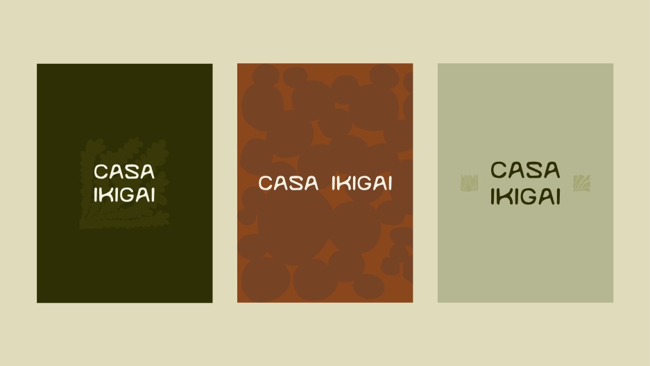
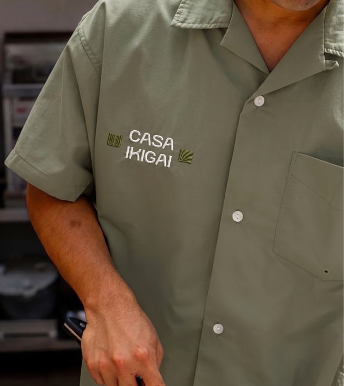
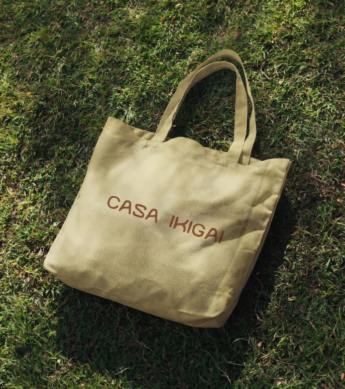
The wordmark needed to feel equally at home everywhere the brand would land. The typeface was defined for its gesture, its humanity, its small imperfections, so the letters read less like a logo and more like a note left on the table.
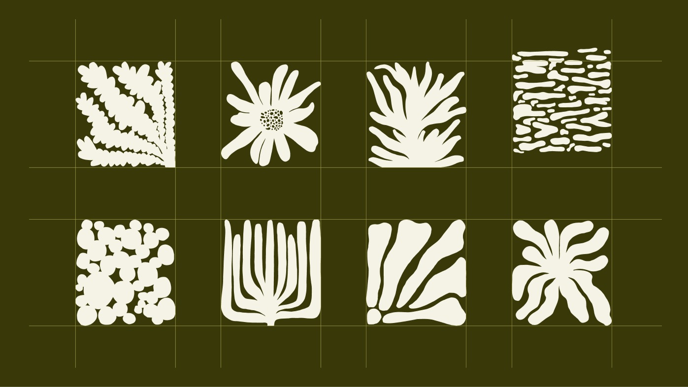
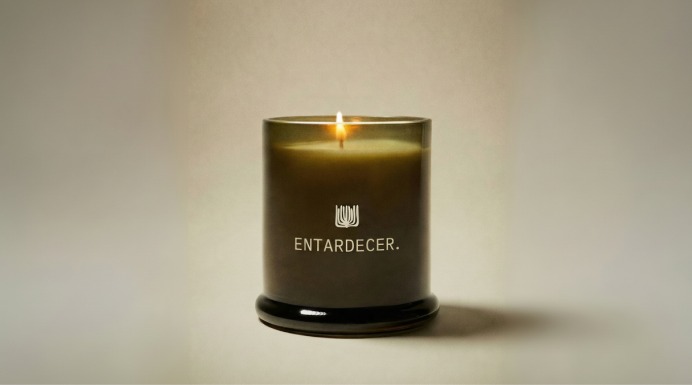
A system of botanical illustrations built from the vegetation and textures of Casa Ikigai itself. Eight marks, one gesture: simple, organic, unmistakably grounded in the place that inspired them.
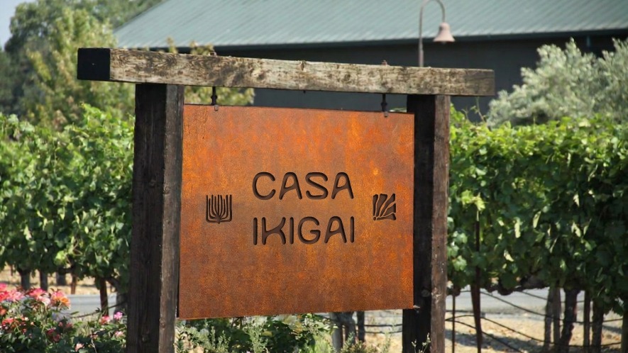
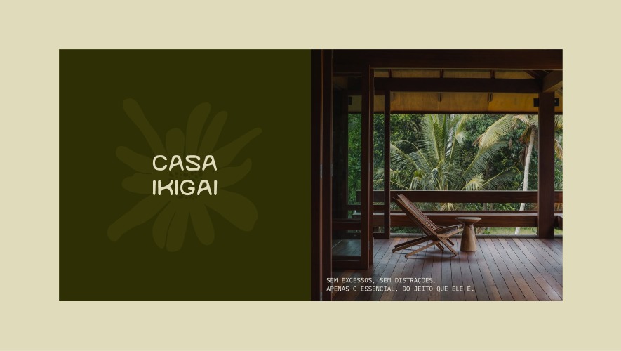
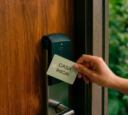
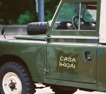
The essential, everywhere it lives.
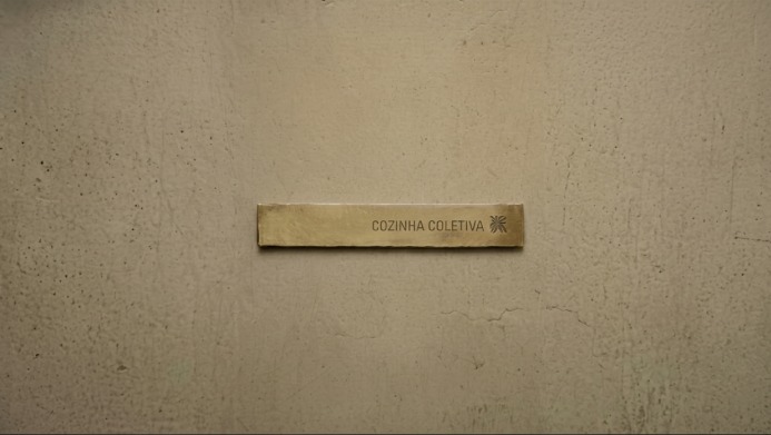
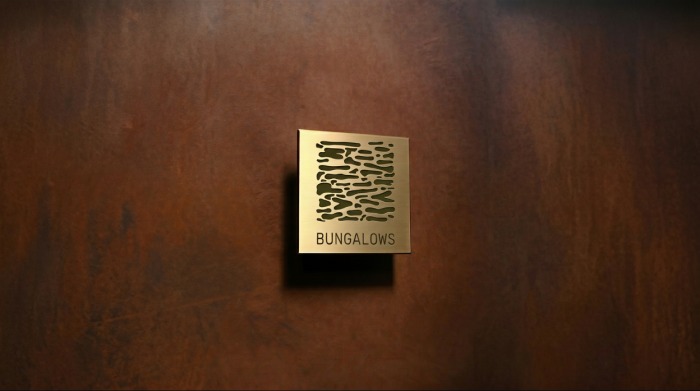
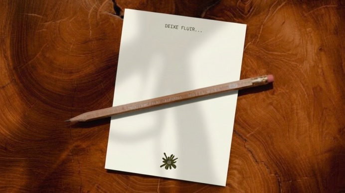
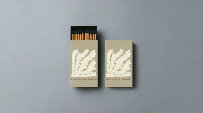
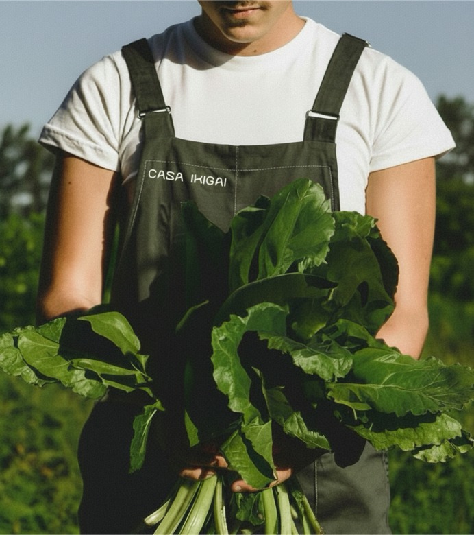
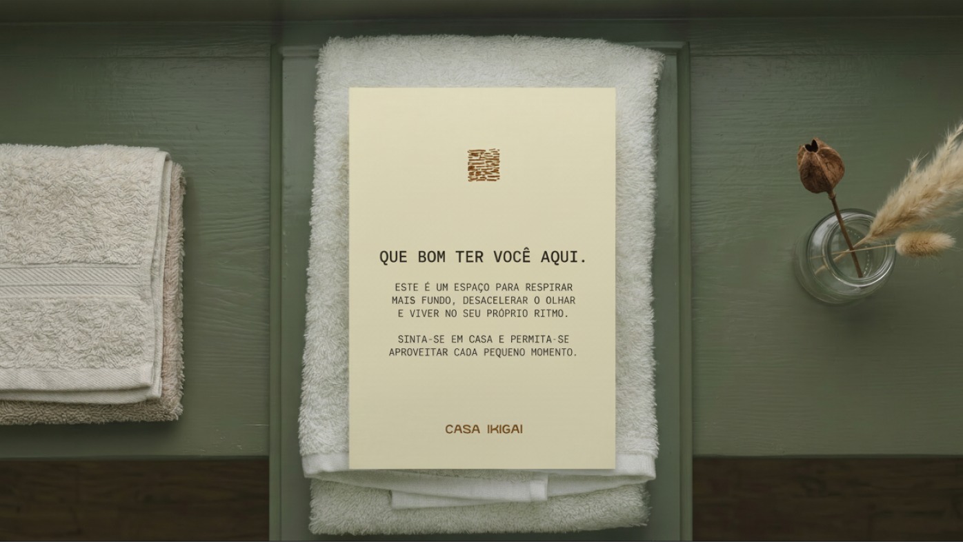
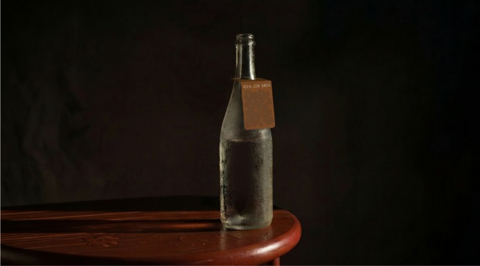
The identity lives in the details that don't ask to be noticed: the entrance sign, a bungalow door tag, a card slipped into a guest's hand. Small amenities carry the same human touch, at every scale. Nothing shouts; everything belongs.
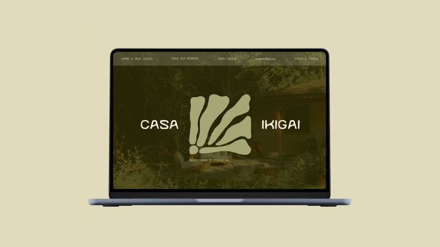
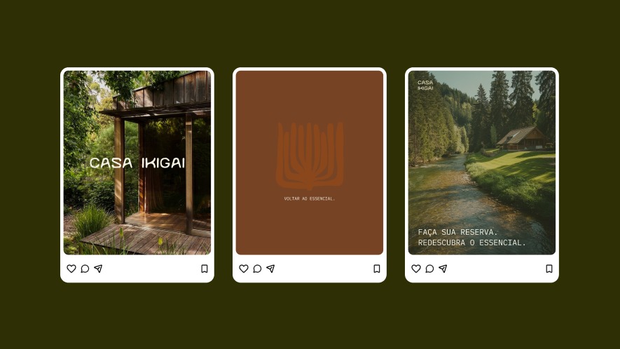
From the ground it sits on, to everything it touches.